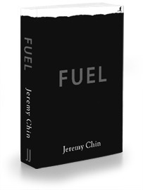
Book cover
 Have not given all too much thought to the book cover. This is the first design I've come up with. And I'll probably stick to if nothing else comes to me.
The heavy use of black and the uneven surface on the top was to lend the appearance of crude oil (or fuel). But the silhouetted runner in the top left corner changes that, and shows that it is in fact uneven terrain he is running on. This I felt, was the best way for me to combine the concept of FUEL with RUNNING.
Let me know what you think.